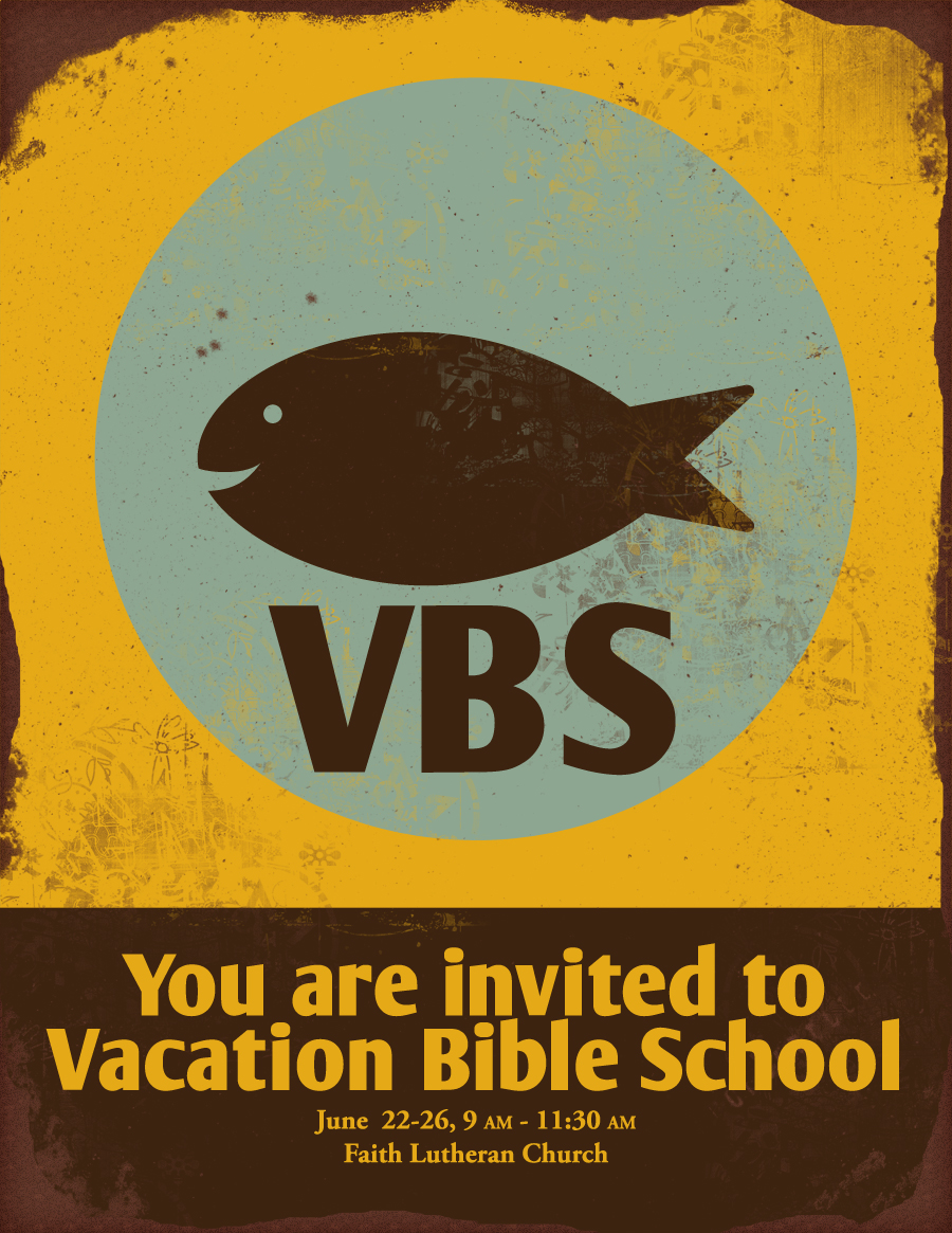
Basic Flyer Design: Free VBS Flyer Background
This is a free flyer idea that you can use this summer. It lends itself well to a classic "Fishers of Men" themed Vacation Bible School for church. It could also work for a party poster for kids this summer, either swimming or birthday. You can put the pieces together using Microsoft Word, or any other flyer design program of your choice. (For free programs check here.) The background design is a downloadable freebie I'm providing for you here. I've set up the background file for you, so that you only need to add your own text.
1. The Background
Download the background file I have already created for you. Click on the background image below, then right click on the dropbox image and "save as" to your computer. The background is sized to fit a 300 dpi letter sized page. If you have access to full bleed printing, this file goes edge to edge. If you have a standard printer, then shrink the background appropriately to accommodate your margins.
2. The Fonts
The two fonts used on the sample flyer are Garamond and ArmWrestler. Garamond may already by installed on your computer. If not, Font Squirrel will help you out. ArmWrestler is also available at Font Squirrel. Arm Wrestler is a nice strong sans serif font, with a slight playfulness to it. (You might guess the playfulness with a name like ArmWrestler.) Garamond is one of my go-to serif fonts for general text. For tips on downloading and installing fonts, plus additional typography suggestions, read here. Be sure to size your main message to be quite large, so that it can be seen from a distance. The details can be smaller, legible once the reader is drawn in by your fun retro poster and clear title. You'll most likely have more details than my sample, but try to keep them within the brown box at the bottom. That's the detail zone. I recommend printing a sample, posting on a wall, and walking a number of feet away to see how clear it is.
3. Put Your Flyer Together
If you've been keeping up on your flyer design basics here on Corissa Nelson Art, then you are all set to begin. If not, take some quick lessons in previous Basic Flyer Design articles. For tips on actually laying out your flyer, you can refer to Basic Flyer Design: Implementing Your Concept. For the conceptual idea of simplicity in flyer design, along with a couple of nice examples, read Basic Flyer Design: First, Keep it Simple. This layout is a simple background image, with text boxes over the front, using only two fonts. Always keep it simple.
4. Additional Resources
For additional resources available to you when designing flyers, take a look at my Creative Commons board on Pinterest. Or, find some inspiration on the Graphics board. Also, check out the following articles.
Basic Flyer Design: First, Keep it Simple
Basic Flyer Design: Implementing Your Concept
Basic Flyer Design: 6 Free Resources You Can Use
Basic Flyer Design: Typography
How to Use Microsoft Word with Step by Step Instructions and Photos
Would you like to see more freebie backgrounds and flyer tips? Please comment below on what you'd like to see!

